The evolution of an illustration
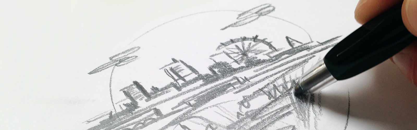
For the contact page on the Project Simply website, we wanted something illustrative to show that we are a Manchester-based company. We hit upon the idea of creating some sort of graphical representation of Manchester. Next we needed to think of what style we would go for; 3D? 2D? isometric? We thought the best way of progressing with the idea would be to break out pencil and paper – so that is what we did.
Sketching
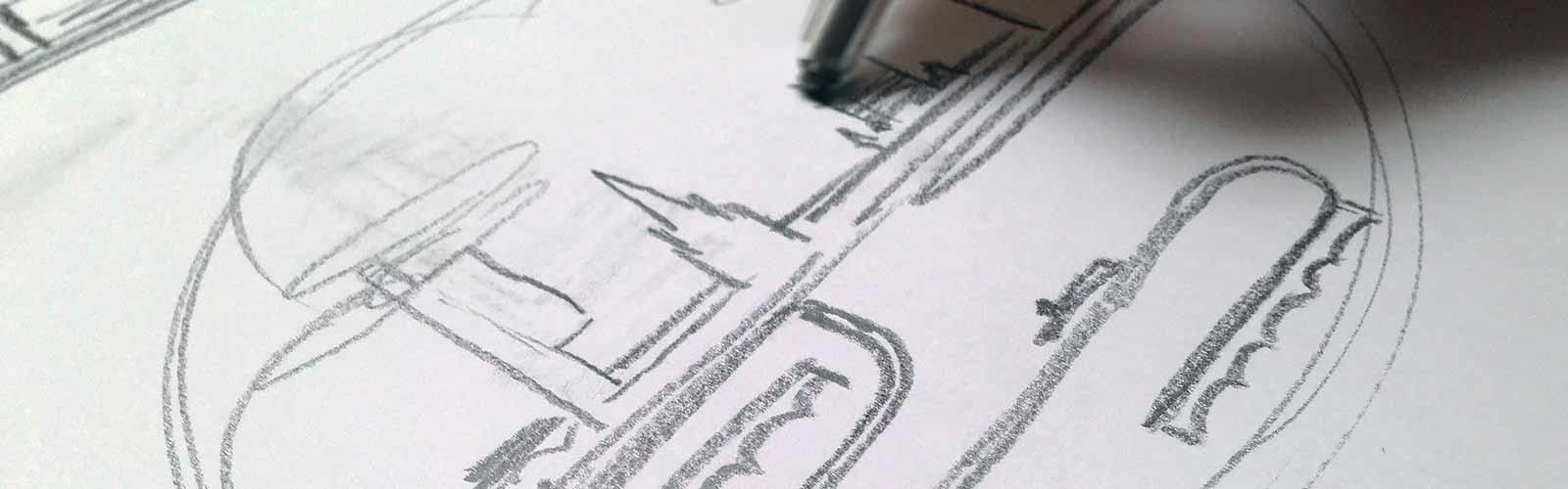
We started by loosely sketching some ideas on paper, slowly creating some pencil outlines of recognisable Manchester landmarks. Through sketching we realised that a skyline of the city would be an awesome idea – so that’s what we went with.
The thought process
It’s interesting how ideas can progress by simply picking up pencil & paper and starting to sketch. From having no idea, to letting your hand draw off-the-cuff shapes – the thought process can quickly change and dart off into different directions. It is this freedom of thought working together with the conduit of the pencil, which allows us to go off in a completely different direction at a seconds notice – exploring different ideas along the journey.
A considered approach
Next, we identified which buildings we would use to form the skyline with. Which buildings would easily be recognised? Which ones would we leave out and why? We decided, based on the fact that we were creating what was pretty much a 2D representation of Manchester, that there were certain buildings that simply would not work well in this format.
We also wanted to concentrate on landmarks which were are centrally located as possible, giving a concentrated overview of the city.
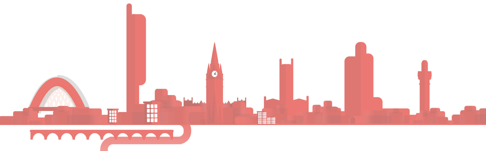
The buildings we decided to go with were:
- Hulme Arch Bridge
- Beetham Tower (AKA The Hilton)
- Manchester Town Hall
- Manchester Cathedral
- CIS Building
- Strangeways Prison chimney
- Canals & viaducts
- Manchester Ship Canal
- Various boats & ships
Once we had decided on which landmarks would form the basis of our skyline, we cracked open Adobe Illustrator and set to work.
The basic structure
Firstly, we starting creating simple shape outlines of each landmark and then placing these on a rough base of simple blocks to form a very simple skyline shape.

Refinement
Next, we refined the buildings shapes to be more recognisable and placed them in the order we would expect to see them based on location within the city. This was not completely necessary, as it is just a representation of the city, but we thought it may help in determining each landmark if it was placed in an area you would expect to see it (just as if your eyes were to scan the skyline from our location here at the Sharp Project).
At this point we also added some colour to the buildings, namely the Project Simply corporate colour of salmon pink. we started to add layering to the buildings by creating a contrasting darker colour to give a feeling of depth.
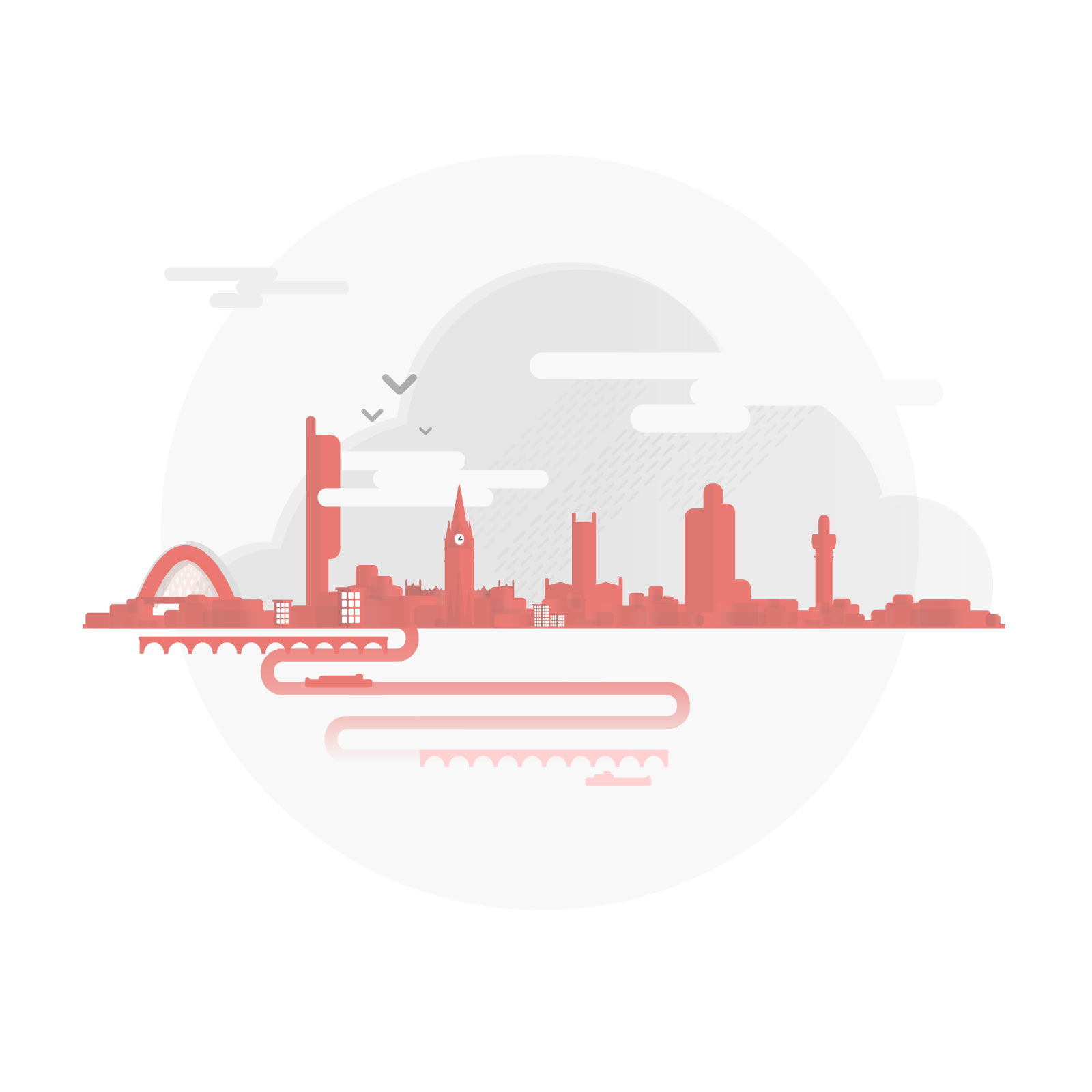
Adding some flourish
When we were happy with the look of our skyline, we started to add some flourishing touches to the illustration. As Manchester is known as being a ‘rainy city’ we thought that adding some clouds and some rain would make the whole graphic more recognisable. Adding in some birds to the sky helped to give a sense of life.

Finally, we framed the whole skyline graphic in a circular background. This made the skyline feel somewhat encapsulated and also allowed us to play with elements which overlapped and ‘popped-out’ of this background, adding to the felling that the skyline is forever changing and that Manchester itself it can never be completely captured graphically.
The finished illustration
What is your process for creating illustrations? Do you follow a specific process? We want to know how you work – just leave us a comment below!
