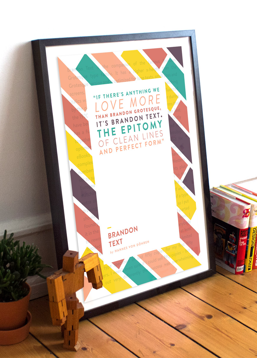
Font of the week – Brandon Text
And welcome to this week’s edition of ‘Font of the Week’ – today’s special guest is Brandon Text.
But first, a little background on this typographic beauty, taken directly from the creator’s website.
“Brandon Text is the companion of the famous Brandon Grotesque type family. It has a higher x-height than the Grotesque version and is optimized for long texts, small sizes and screens. This sans serif type family of six weights plus matching italics was designed by Hannes von Döhren in 2012.
Influenced by the geometric-style sans serif faces that were popular during the 1920s and 30s, the fonts are based on geometric forms that have been optically corrected for better legibility. Brandon Text has a functional look with a warm touch and works perfectly together with Brandon Grotesque. It is manually hinted and optimized for screens, so it will be a good choice for Websites, eBooks or Apps”.
Visit the creator, Hannes von Döhren at – http://hvdfonts.com/brandontext/
