We know your marketing budgets are stretched, and with the increasingly competitive nature of the festival landscape it’s more important than ever to spend those budgets in the most effective way. We want to help you extend your reach and engage with your audience; your current and future festival goers. We’ll look at ways to target the hardcore festival fans who will share your content, help build an online community and upgrade their tickets to VIP status.
Using tried and tested social channels to engage with and wow your audience is a given, but if you want to go the extra mile, innovate and stand out from the crowd, have a think about doing the following:
1) Livestream Your Festival
Livestreaming your event gives users unique and memorable access to the festival experience you are offering.
There’s some interesting stats around this one. Research from Digitell showed that 30% of fans who watched a festival on livestream then attended the festival in person the following year. Makes sense to market the opportunity to watch the festival live across social channels and to all subscribed but non attending users, once tickets have sold out, maximising initial marketing spend.
Kendal Calling teamed up with Twitch this year to livestream their festival playlist with a staggering 418,000 views of their channel. This won’t be unique users but if the 30% rule applies then they have just gone some way to getting a sell out event next year.
Combine the livestream access with some data capture and you’ve got a burgeoning super fan list and lots of potential attendees next year.
Additional benefits of livestreaming:
- Maintain participation with your existing audience not able to attend the current event
- Interact and engage with your audience in real time
- Increase reach to wider audience with relatively low budget spend
- Livestream from VIP viewing areas, pushing the value of VIP tickets
- Generate content for other marketing opportunities across platforms

2) Get Artists to Promote For You
If your festival is focused on music it goes without saying that your line-up should be engaging with their fans on social media in line with your own marketing efforts.
No artist wants to play to an empty field. Consider creative tools that encourage fans to see their favourite artists at your event:
- a unique location,
- a sunset in the background,
- similar artists to discover,
- an exclusive new track or cover to be performed only at the festival
- meet and greet competition.
Make it distinct, unique – a reason for fans to be in front of that particular stage.
Encourage performers to embed ticketing on their sites. See who is bringing their own crowd and gain useful data on who is worth booking again.
3) Leverage Facebook Messenger to Boost Ticket Sales
According to MailChimp, the average email open rate for the music industry is 23%, with a click-through rate of under 3%. We think you can do better than that.
By pulling your fans into the Facebook messenger platform you escape the perils of email comms, fraught with non delivery, spam filters and the dreaded promotions tab.
With FB messenger you can engage in a more conversational way, and when you do send messages they pop up on the user’s homescreen; winner.
The possibilities for preference based marketing, merchandising and incentive based social sharing are huge including:
- 100% visibility of comms – with email and Facebook organic reach the % of people actually reached is low (between 4-30%). With our solution all messages appear on the user’s mobile phone homescreen, with 100% delivery.
- Incentivisation – we have created an in built Affiliate system in our Facebook messenger bot which is the perfect place for requesting social spread via fans for incentive based outcomes i.e sell tickets / generate sign ups.
- Personalisation – you have the ability to gather rich interest data on attendees quickly and easily (i.e who are you most looking forward to seeing at the festival ?) By doing this you can then engage based on their interests with relevant content /offers.
- Merchandising – By gathering interest data you can merchandise and cross sell pre , during and post event.
- Spin off gigs – If you know what people like, where they live and can message them with 100% delivery whenever you want you can create a multitude of smaller spin off gigs with little to no extra marketing spend. Welcome to the profit centre

People often need little incentive to use Facebook, but they do require that something extra to share content. Consider low cost incentives such as special offers, early bird access or news, to show appreciation to your audience and encourage fans buy in.
4) Ensure Third Parties Deliver
Now you have your own marketing as well as your artists pushing the message. It’s now time to lean on your 3rd parties to help spread the word.
Work with a ticketing provider that has a sophisticated marketing program that includes pushing out targeted messages to its database of users. With kickbacks and commission in play, your ticketing provider is already incentivised to promote your event. Ensure your partners are 100% mobile optimised and use affiliate codes to ensure proper tracking.
Eventbrite found that the most common sites fans visit after ticketing pages are Google Images and YouTube. Your audience want to see visuals of the event and listen to artists who are performing before they commit. Supply these assets and embedded links to your 3rd party sites to encourage additional time on the ticketing sites and quicker conversions.
5) Further Exploit Video
Engage people through the power of video, specifically using YouTube to build a fanbase.
- YouTube creative content
Belgium’s Tomorrowland used this platform brilliantly, garnering 38 million views and over 250,000 likes on their promo video release. Granted, it was a humdinger at 32 mins long but don’t let that put you off, just create something that will appeal to your audience and get sharing it.
- Fan videos
Hardcore festival fans are now more likely to share videos of the events they attend than pictures. Create multiple opportunities for your audience to do this at the event and make sure you have the tools in place to capture what is being shared:
- Festival hashtags – promoted on stage graphics, food vans etc. and promotional materials around wifi access points and charging stations when users are focused on their phones.
- Share fans content in real time (referring back to their social handles so they feel a sense of recognition), encouraging them to share and capture more footage.
- SnapChat geofilters – make it really easy for festival goers to boast about where they are.
- Re-use livestream content
Content from livestreaming doesn’t have to be lost after the moment has passed. Save and share the content to attendees after the event. Help them relive the moment and share the moment with their friends, encourage them to tag themselves to show they were there. Make sure you also provide your live content to the artists featured so they can share it with their fans.
So how can we help? With plenty of experience helping to grow festivals, we know what it takes to build a beautiful, functional website to take you to the next level.

Look into my eyes
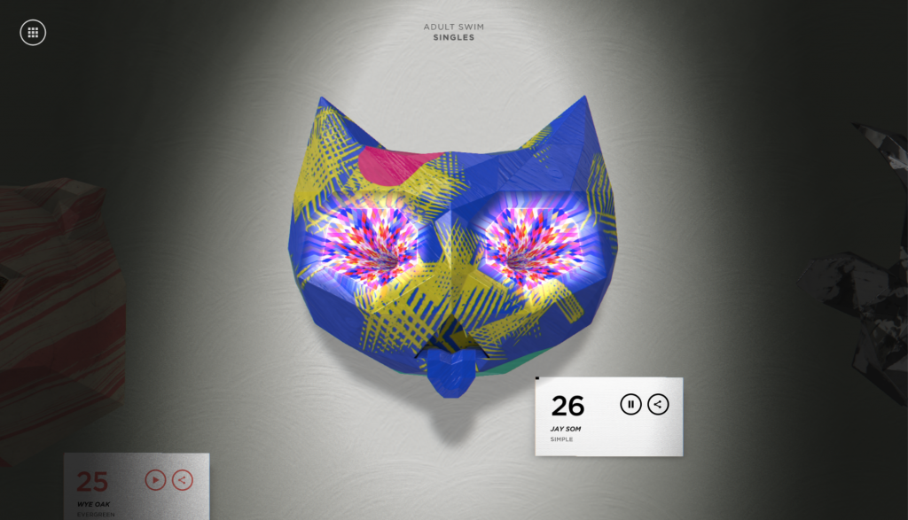
1. Adult Swim – Singles
For what is essentially a side scrolling website with some autoplaying audio. Adult swim has been drinking the Kool-Aid when it comes to the animations and illustrative design. Chintzy ornamental wall hanging animals are given a metallic and cold isometric texture, with psychedelic hypnotic eyes. Non of this makes sense, and nor should it.

No need to dye when grey is this hot
2. Shallou
This one page website is pretty low on content, but what is does have is a silky smooth scroll and cool AF 3D glasses glitch effect on the images as you scroll up and down. Typography is super boomed up. Some might say this is really good accessibility practise, I say it looks blummin’ swish.
A large festival doing a good job, finally.
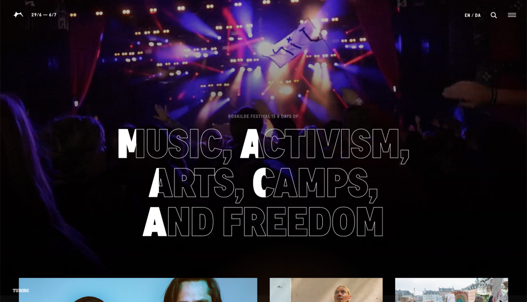
3. Roskilde Festival
We have been collaborating on a number of music festival websites so I’ve seen quite a few in my time now. More than not where large scale music festivals are involved their websites can be visually very poor. It’s normally the smaller festivals that push the creativity. The new Roskilde Festival update for 2019 has done the best design job for a large festival I have seen, they have used some hip typographical design with outlines and large headlines and although built on a grid system the content has a structured yet hap hazard approach which I kinda like the vibe of.
Wavvvvvyyy garms
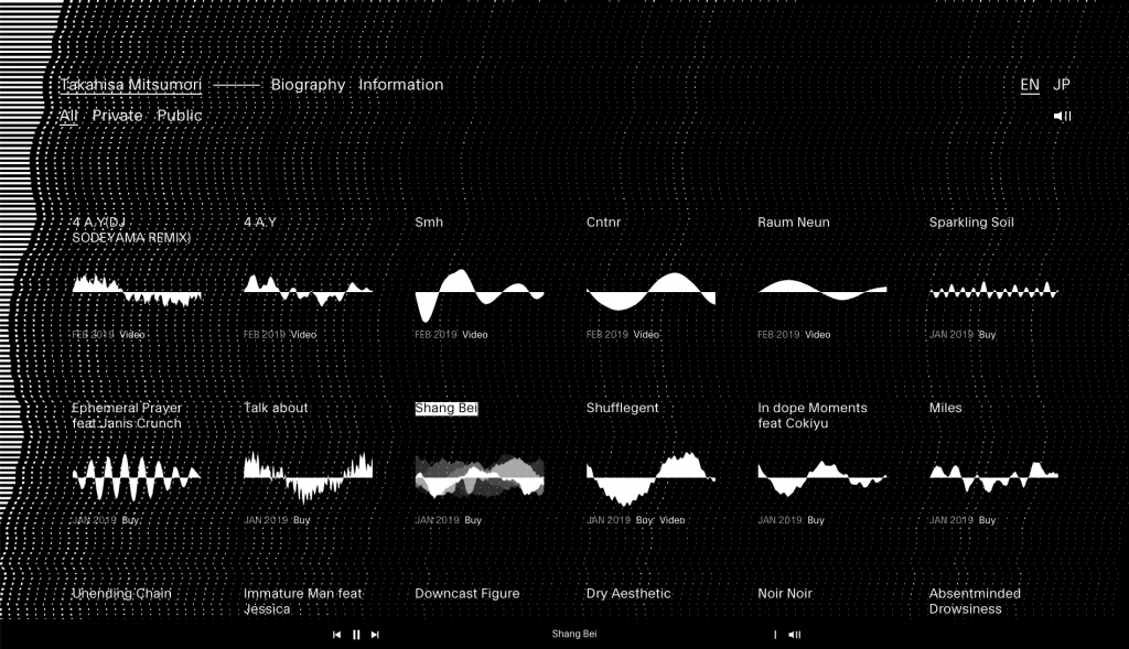
4. Takahisa Mitsumori
A tour de force in monochromatic design. Each track is displayed using its waveform which then animates when clicked in tandem with the rest of the viewport to create a full screen visualiser.
The good ol’ days
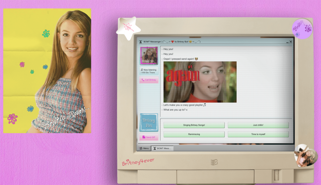
5. Britney OS ’99
Don’t know what to say about this one. Is this a bit wrong? Just gonna leave it here and forget that it exists.
]]>A bit about us…
A creative digital agency based slap-bang in the centre of the NQ – we are a small but fast growing team, producing our own IP and working closely with our clients in the festival, music and lifestyle sectors.
We build websites, apps, online experiences and strong memorable brands, only working with clients we like and building good relationships along the way.
A family of experimenters and creatives, we really look after our people and understand the benefits of being an independent owner-run creative business. We have plans to open our own ventures arm within 3 years to develop and run our own commercial ideas and work on passion projects for charities and worthwhile causes.
What we are looking for…
Not just another number, but a new member of the Project Simply family!
If you want to have more ownership of the work you produce, like the idea of working directly with clients in the music and leisure sector, and feel stifled by larger agency mentality – we are interested in meeting you!
We are looking for a proactive, strategic thinker who will help to shape our development processes and the frameworks we adopt.
The Role
We are looking for a Front End Developer to create incredible looking websites and web applications for our clients. You will love to experiment and push the boundaries at every opportunity and understand what looks great, as well as what will work for the client.
Must Haves
- Organised – practice, process and structure driven
- Proactive and eager to develop
- Experience building functional & data-rich web apps.
- An expert ability with all things HTML5
- Git knowledge
- A love of bleeding edge early adoption
- Great skills with building technical interaction design
- A desire to create and experiment
- Javascript and JS frameworks expertise
- Good understanding of PHP and PHP Frameworks
- SASS, NPM, Browserify or similar
- You should be able to understand directional briefs, and business requirements. Then scope, prioritise, and propose suitable technical or process solutions
Not essential – but a massive bonus!
- Design skills
- Adobe Products
- Figma/ Sketch
- Managing your own time and helping orchestrate others
- An understanding of backend development logic
- An understanding of systems architecture and database queries
- Interest in side projects and meetups
Benefits
- Competitive salary.
- You’ll get to work in our NQ studio with a great team
- Plenty of scope to take ownership of the work you produce.
- R&D time
- Plenty of Xbox time
- £1000 personal development budget
- An extra day holiday increase for every year worked
- Additional holiday when the office is closed over Christmas
- Your Birthday off
- Flexible working hours
- Work closely with clients and help them bring their ideas to life.
- Free weekly lunches, fruit, and beer in the fridge.
- Monthly team socials.
If this sounds like you, please do contact [email protected] and let’s chat.
]]>
Having a well oiled, member or customer acquisition engine running smoothly is obviously the key to any business or organisation but in terms of being an essential part of your strategy; there’s another aspect that is arguably much more important than simply getting people through the door.
We are of course talking about retention and engagement. You don’t want your website to turn into a revolving door; people go just as quickly as they come, leaving your online space as a digital reflector – causing people to dismiss the main reasons that they signed up, joined or purchased in the first place.

To put it simply, the key is not in the initial attraction, but getting them to stay. While this sounds like a rip off of some dodgy dating advice guru; it really is about keeping your audience as interested as possible for as long as possible. An article in Forbes explains that working out the Life Time Value (LTV) gives you an idea of which of your audience are here to stay and which ones are here for a good time, not a long time. What is the use of this information? Basically, it allows you to better understand where you should be spending your resources (be that marketing spend, human resources or simply time and effort).

Think of it as a numbers game.
If you spend approximately £500 in marketing per member acquisition, with each person spending £150 for an annual membership – this doesn’t initially appear to be a good investment on your part. If you then discover that on average for your organisation, a member who stays engaged for a long period of time; attending numerous events (approximately 2 per year at £100 per event), enrolling in your courses (1 per year at £1000) and staying on as a member for 5 years, you’re looking at approximately £6,750 in LTV for a member that only cost you £500 to acquire.
The crux of all of this is ensuring that you are creating an environment that your members are finding engaging enough for this revenue cycle to continue. There are of course many other benefits of improving your website’s member engagement but increased Life Time Value, improved SEO and increased user satisfaction are the main players.
According to HubSpot, it’s important to use data more effectively. They state:
If you’re just tracking how many people have visited your site and what they bought, you’re missing out.
Hubspot
Effectively, as HubSpot are suggesting, there are many different elements of your site that you should be tracking and using in order to improve your user engagement. If you can do this, you are well on your way to both improving performance, retention and Life Time Value.
So, we put together a handy guide for you to not only find out which metrics you should be using to gauge your sites user engagement but also actionable steps to dramatically improve your organisations member engagement. Don’t have members per se? Not to worry! The guide is still relevant for organisations that don’t necessarily have a membership base but also want to improve the engagement of it’s website’s users.
]]>There is a lot of information floating around the internet about what GDPR is, why it is being implemented and the astronomical fines that you could potentially incur for the most serious cases of negligence involving personal data. However what is lacking is the practical advice and examples to help you work towards GDPR compliance.
Whether you haven’t even started to make changes yet or you are simply looking for a benchmark to check yourself against, we have put together some examples below of existing and GDPR-ready versions of:
- Location services request
- Data requests, right to rectification and right to erasure settings
- Gaining consent through form fills
- Opt-out vs Explicit opt-in
It’s worth mentioning that the examples shown below are best case scenarios should you be able to achieve them. GDPR is not an aggressive law that is looking to fine and penalise everyone, causing businesses and marketing agencies (such as this one) to be constantly on edge over data. As long as you have your own versions of the below in place with the key learnings taken from the examples, you will be well on your way to being compliant with the change in data protection laws.
Location Services Request – Choice Modal
Typically occurring during mobile sign up due to apps wanting to use location for a number of reasons (availability of services in local area, international restrictions, GPS/positioning for maps etc), this option to share your location should now also come with information about what will happen to this data when it has been stored.
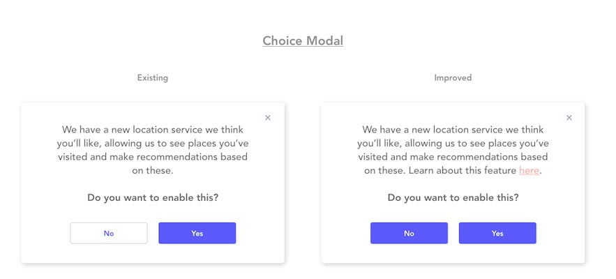
In the choices above, the “Existing” iteration shows that currently, it is designed in such a way to influence you to quickly click the “yes” option and move on without fully reading the information regarding what you are consenting to. In the “Improved” version, you can see that the colours have been equalled across both boxes to ensure no bias in selection. There has also been a link added to an external page that explains to the user what the location based feature is. This page will typically be the privacy policy that explains the feature, what the data is collected for, how it is used and the rights the user has if they want to be forgotten about.
Data Requests, Right to rectification and Right to erasure
The next part concerns subscription centres and the ability to give the control of your users’ data to the user directly. This section doesn’t necessarily compare an existing vs an improved scope for design but rather shows a “minimum” standard compared to an “ideal” design for a subscription centre-style account setting.
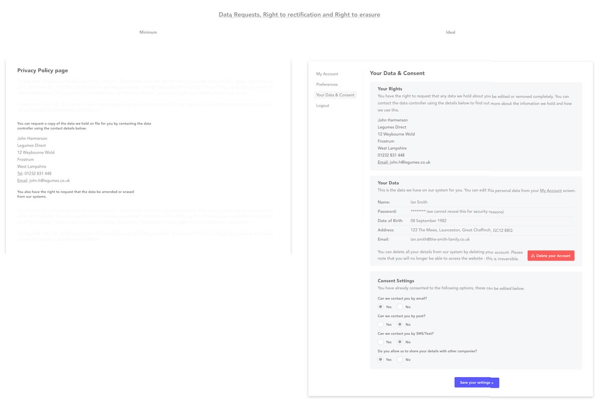
For the minimum requirement, within the privacy policy page you should give clear and accurate information about who in your organisation the user needs to contact in order to request information about what data you hold about them, ask for amendments to be made or to ask for all data to be erased completely (unless it is legally impossible to do so).
In the “Ideal” scenario, there is a special section reserved in the user’s account where they can view their data and consent information. As you can see in the images above, it is clear who the user needs to contact for information about what data is held about them and the user can also see on-screen what information has been stored about them. There are also clear instructions on how to edit and delete information in the online system.
Finally you can see that there is a subscription settings section that allows the user to change what they have previously consented to receive. This can all then be saved to be reviewed again at any time the user wishes.
The main benefit to having the “Ideal” set up is that it greatly reduces admin and processing time on behalf of the organisation. If the user can do all of this themselves then this saves a huge amount of time auditing, searching and amending data as well as documenting the process for GDPR reasons.
Gaining Consent
The differences between the existing and the improved forms here are quite drastic on first glance but don’t let that put you off.
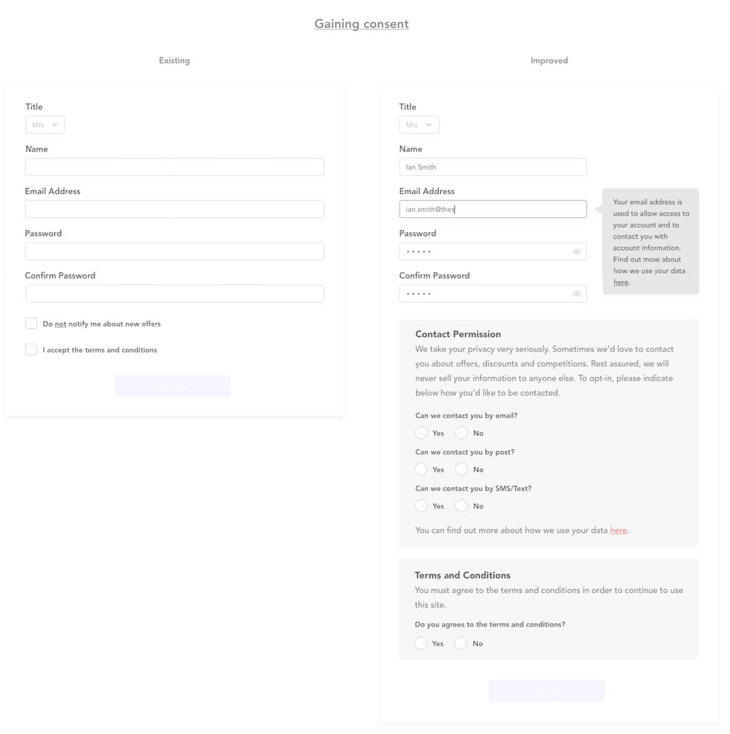
The first thing to notice about the “Existing” form is that there is a “negative” checkbox. What this means is that the user has to check the box if they don’t want to be notified about new offers. Under GDPR this is a very clear breach in that the new law states you must make it clear and obvious what the user is doing when they are signing up to something or offering their consent to be send information in the future.
In the “Improved” section, you can see that it is explained early on to the user what their email address will be used for and a link to the privacy policy. It is then clearly explained under “Contact Permission” what the data will be used for as well as giving the visitor clear and obvious options as to which types of information (if any) they would like to receive. There is also then a notice that the user must agree to the terms and conditions if they wish to use the website.
Opt-out vs Explicit Opt-in
In this example, we see an extension of the types of consent offered in the previous “Gaining Consent” section. As you can see by the previous form, there is a simple “Do not notify me about new offers” checkbox which as aforementioned, is a negative way for someone to opt-out.
We also see that it has been attempted to include opt-in/opt-out consent information for GDPR purposes but the non-compliant element is the checkbox that is stating that for someone to opt-out, they must check the box.
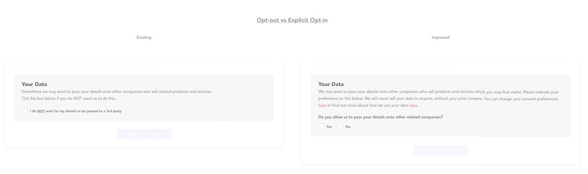
Another element to take note of in this particular example is that the consent it is seeking is to allow the company to share information with 3rd parties. The “Improved” example here explains in greater detail that data will not be sold to 3rd parties if you do not consent for this to happen and there is a very clear Yes/No option to the checkboxes. There is also a link back to a privacy policy that will explain this in more detail.
Another detail here is that the box to continue or submit this information is “greyed out” and will only be available to click once you have entered a response to the consent question.
]]>Usually we would create static wireframes in our tool of choice, whether Illustrator, Photoshop, and more recently, Sketch. We then send these wireframes onto the client, expecting them to imagine what would happen if they clicked a button or dragged an image.
This is fine for most projects, with the client able to grasp what we’ve designed with a brief explanation of the elements within the design and how these would interact. They would then come back with any questions and we would answer these — culminating in a design which is both agreed and understood.
However, there are some projects that need an extra level of interaction. The ability to tap, click, swipe or drag can be key to making a great design more easily understood.
The key is to make a design work not just how we intended, but also how the client subconsciously expects it to work.
For these projects, we needed a tool that would allow us to add that extra layer of interaction and animation. These tools are known as prototyping tools, of which there are many, all vying to become our next best design friend.
The aim of this article is not to give a direct comparison between all the tools we evaluated, but to elaborate on our experience of using them — and ultimately, decide what works best for us. You might decide otherwise, which is great, that’s cool — we’re not monsters.
The quality and functionality of these prototyping tools vary wildly, but they all work in at least one (or more) of three ways; Page-based, Element-based and Hotspot-based. Allow me to explain…
Page-based, Element-based and Hotspot-based
Page-based prototyping
is the ability to link individual screens together to navigate through them one-by-one. There is commonly only one interaction assigned to the whole screen, which is usually in the form of ‘On screen click, move to screen X’.
Depending on the level of functionality, this interaction can be combined with an animation (left swipe, fade in) when moving from one screen to another.
Element-based prototyping
is the more powerful and flexible of the two types and allows us to assign interaction(s) and animations to individual elements on a screen — button, links, images etc.
Being able to apply interactions to individual elements allows us to create ‘real-world’ prototypes and to consider the user flow in a more in-depth way, covering all potential routes into and through an app or website (for example).
Hotspot-based prototyping
is a hybrid of the above two methods and allows us to create similar prototypes but in a more basic way. We can only apply interactions and animations to the screen as a whole, but using hotspots we can define interactions within areas of the screen.
What this means is that you are not actually selecting an individual element and applying an interaction, but rather drawing a hotspot over the element region and defining what should happen if the user interacts within this defined space.
Page-based (Left), Element-based (Centre) and Hotspot-based (Right)
What features we’re after
Given our existing workflow, and without having to change the fundamentals of how we work day-to-day, we wanted to consider tools which had:
A killer user interface
We need an intuitive user interface, this is a given. Not something cobbled together in some guys basement using MS Paint. Something which scales back all of the tools and features into a usable, clean and familiar interface. It’s for this reason that we started using Sketch as a tool for designing some apps and wireframes — the simplicity of the interface.
Zero-training
We don’t want to have to send our designers off on a 2-week UX holiday just to learn how to use a piece of software. It’s also important that we don’t have to completely change our daily workflow to appease the tool of choice, which is why we looked at tools which integrated with Photoshop and Sketch.
Prototyping goodies
The more prototyping features the better. Everything from being able to create simple transitions between screens, animating UI elements and being able to preview these on-screen and on native devices (iPad, iPhone, Android etc). We want to be able to drag text onto a workspace, type something nice and then easily replace it.
Sharing stuff
The ability to share directly with clients, enable comments and then reply directly is of great importance to us. As I’m sure it is to you.
So, let’s crack on yeah?
![]()
InVision (Online) — Hotspot-based
Firstly, we’ve been using InVision for a few years now and for us it covers a multitude of needs. Everything from a central place to upload designs, share with clients and enable comments. We can add hotspots to static screens and link these to other screens very easily.
The team at InVision are doing a fantastic job, with new features coming out all the time. Where InVision falls down currently is its lack of animation and transition features. We’re hoping this will all change with an upcoming feature which InVision are calling ‘Motion’. It looks like a game changer. If they get Motion right, coupled with the existing feature set within InVision, this could be the only tool you need. We’ll have to wait and see — check out the promo for this yourself at http://blog.invisionapp.com/motion-prototype-animation/
The interface
The look and feel of the whole InVision interface is pretty darn great. Everything is clean and intuitive to use. We found InVision to have a quick learning curve — even our Account Managers, Copywriters and office pooch got to grips with it easily enough. Managing multiple projects on the system is very easy to understand (see Fig.1)
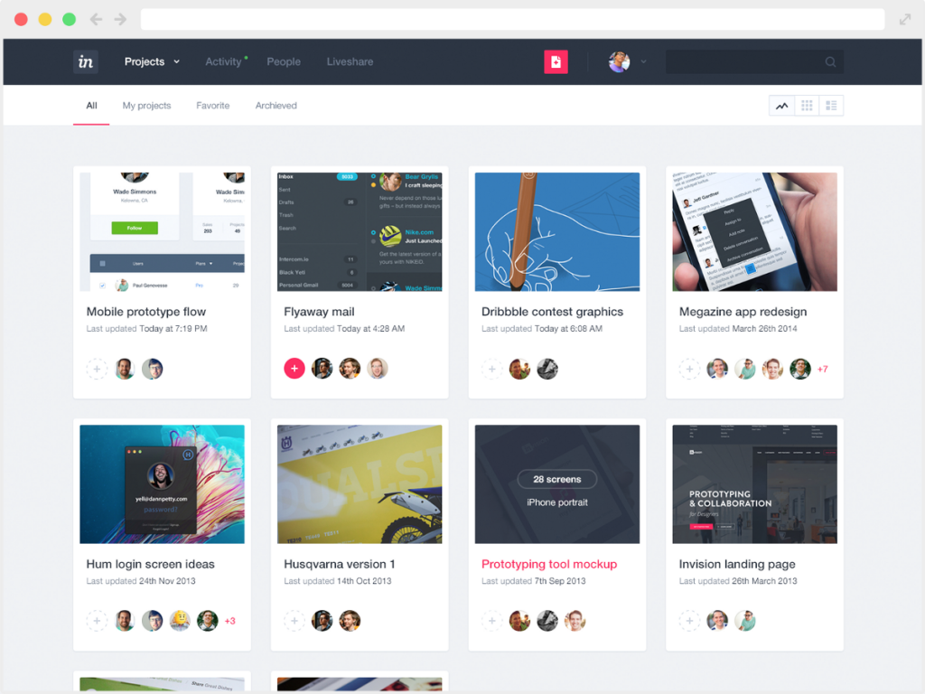
Fig.1 – the InVision interface
The features
Interactivity is key for us, and InVision let’s us handle this easily. We can import the UI for an app screen, add hotspots and interactive hovers, and send this to the client — all within the time it takes for our developer Jon to make a greasy cup of tea. The commenting system is powerful and fully formed, allowing our clients to easily click on a portion of the design and add any feedback.
Niggles & Bugs
We do sometimes encounter weird juddering on the project overview screen, which seems to be related to scrolling within the browser — sometimes I’ve had to refresh the page to stop this from happening. Also, keeping track of comments can sometimes be difficult, especially if you have clients that like to comment on every single pixel of the design.
Pros
- Very clean and intuitive user interface
- Quick learning curve
- Easy to use interactivity features
- Commenting system
- LiveShare is excellent
- Simple transitions and gestures using the overlays feature
- Integrates and syncs with Sketch and Photoshop
Cons
- Very limited animation and transition features — limited to hotspots to move between screens and some hover effects
- Cannot design within the interface, designs are imported and hotspots applied on-top.
Summary
Overall, we can see InVision being part of our future for some time to come. It does most of what we need, and, should Motion prove to be powerful enough, may even turn into our one-stop shop for prototyping interactivity and animations. You can find InVision here.
Principle (OS X App) — Element-based
A Mac only, standalone app for creating animated and interactive user interface designs. It does what it says on the tin.
The interface
Comprising of a main window, with all the design and interaction tools, and a preview window showing a live view of your current prototype. The idea of a separate preview window is good in theory, although it makes the interface feel a little disjointed. There’s no denying that it is still useful and helps to quickly iterate the design.
It has the simplicity of a Keynote-like interface including all element properties and settings in the sidebar (see Fig.2)
Fig.2 – The Principle interface
I couldn’t help feeling like all the elements available to me weren’t immediately apparent . The part of the interface where the element tools are grouped feels very basic, with only Rectangle and Text being visible (see Fig.3)
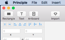
Fig.3 – Where my Circles be at?
I would have at least expected a Circle or Shape tool. In comparison, UXPin gives you a veritable smorgasbord of element tools (see Fig.4)
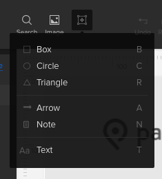
Fig.4 – Elements galore!
The features
Principle’s strength is in its interactivity tools. It uses a timeline-based system for adding time-based animations and interactive elements. This seems very powerful, yet familiar, feeling very much like a mix between the animation timeline in Photoshop and the parameter-based keyframe system of platforms like Flash and After Effects. It’s worth noting that those with experience of using Sketch will find its interface very familiar — Principle even goes as far as to utilise some of the same icons in it’s UI.
The niggles/bugs
The only niggle we had was with the colour of the interface, not really a deal-breaker but sometimes staring at a grey/white interface for hours at a time can screw with your mind — it would be nice to be able to change to a darker version perhaps.
Pros
- Great for interaction design (including motions and gestures)
- Uses timelines for more advanced animations
- Integrates with Sketch
- Live Preview is useful
- Preview on native devices (via Principle Mirror app)
Cons
- Cannot share online (only export to video or animated gif) — not good for sharing an updatable URL with clients.
- Limited tools for creating elements
- Live preview screen can sometimes feel in the way
Summary
If you’re looking for a tool which has powerful interactivity features, and you are comfortable with the slightly more advanced timeline/keyframe way of working, then Principle may be the tool for you. Just be aware that it’s not made for designing with and is just purely a way of applying interactions and animations to imported designs.
UXPin (Online) — Element-based
This online prototyping tool is a fully-featured, mature system which allows you to design, animate and add interactivity, integrates seamlessly with Sketch and Photoshop, with export plugins available for each.
The interface
The interface is, on the whole, very good. You can change the colour of the interface to be darker or lighter to suit your preference. Adding interactions/animations is very intuitive. It’s very much like the UI of the other systems we’re reviewing but based in the browser. UXPin have done a good job of making this usable in the browser, barring the ‘States’ panel, which is extremely frustrating to use (see Fig 5).
Fig.5 – The UXPin interface
The features
Smart elements are a great way of reusing elements across multiple screens. The included element libraries are very good and there are lots to choose from. Also, like the other systems we are reviewing, UXPin utilises a layers palette to keep track of elements on the design.
Sharing is one of the UXPin systems greatest assets, allowing you to share your prototype online at the click of a button. This is exactly what we need to send to clients, without the need for them to install any extra software/plugins — it just works directly in the browser.
The niggles/bugs
We find the interface to be very buggy, sometimes to the point where we think certain functionality is just not finished. Creating new element ‘States’ is touch and go, sometimes it works and sometimes it doesn’t. It is also very difficult to see what states are already created, as the States of the UI is partially hidden —and yes, we tried to increase the size of the ‘States’ panel — but we just couldn’t get it to go any bigger. The ‘Undo’ feature is also flakey, sometimes you have to press undo twice before it does anything (although I believe they may have fixed this in the new update).
Pros
- Integrates with Sketch and Photoshop
- Great Customer Service and Support
- Actively developed with regular features and updates
- Live preview
- Good set of interaction design features
Cons
- Very buggy!
- Some elements either very frustrating to use or just plain don’t work
Summary
The number of features, integration options and sharing/collaboration functionality makes UXPin a very strong offering, but when trying to create a complex prototype, we found that things quickly became very difficult to keep track of.
Pixate (OS X App) — Element-based
Pixate’s strength lies with its powerful conditionals-based animations and interactions. There is a generous selection of animation and interaction effects, which, when coupled with the use of conditionals, allows you to effectively chain different interactions and animations together. Pixate became part of Google in 2015, and other than a major 2.0 release last December, there hasn’t really been much activity within the Pixate camp. However, we really think that the tool has potential so we included it in our review.
The interface
We found the interface to be very intuitive, with a very shallow learning curve. All the tools and properties are laid out clearly, some of them in a similar way to how they are laid out in UXPin.
Unlike other tools, you cannot create new designs in Pixate. To create prototypes you need to design your screens elsewhere and import them. The import process is very simple and once your screens are imported, they are easy to keep track of in the Layers palette.
What it lacks in design tools, it more than makes up for in the power of its other prototyping abilities (see Fig.6)
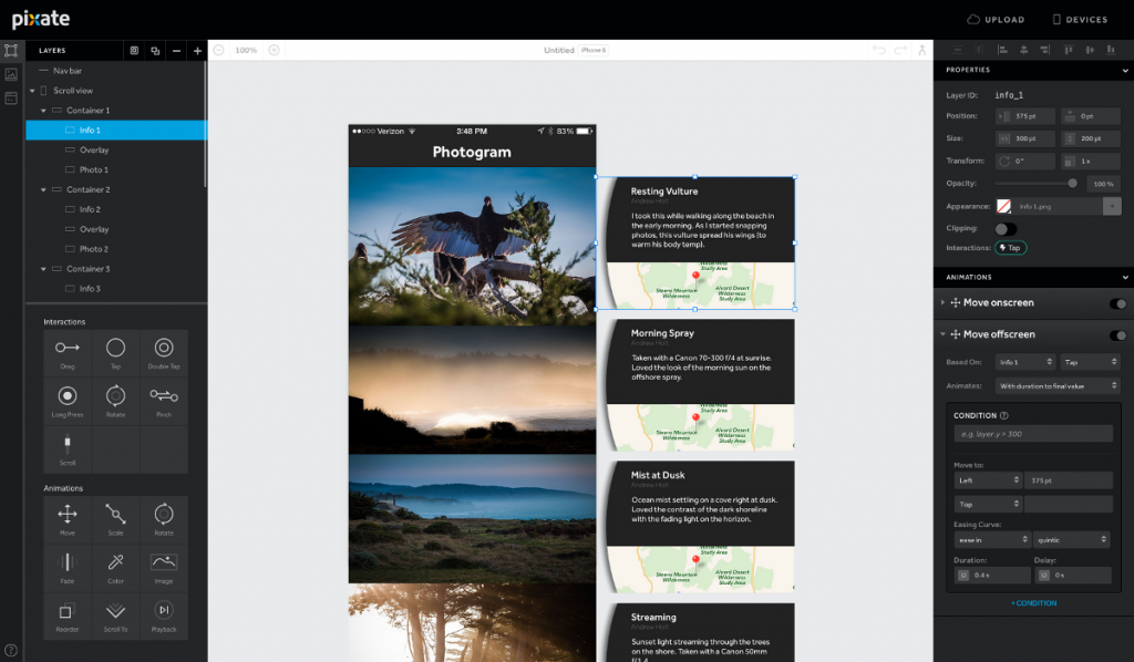
Fig.6 – The Pixate interface
The niggles/bugs
Ok, we found it to be buggy. We often had to find a workaround for something very simple. Maybe now Pixate is part of Google, it will be able to fix some of the bugs.
Pros
- Advanced conditionals (if-then-else) are quite powerful
- Complex interactions can be achieved using ‘chaining’
- Actions feature has real potential
- Support for different device resolutions
Cons
- Cannot export to web, not great for showing a client
- Client needs either a web account or the Pixate app installed to be able to view prototypes
- A bit buggy
- Doesn’t appear to be as actively developed as some other offerings
Summary
The tool is quite powerful and has real potential. It will be interesting to see just how the tool evolves now that the design team are part of Google. it may be that Google integrates Pixate as part of their own offering, in which case it is worth hoping that the tool’s power is retained. www.pixate.com
Other tools We also looked at other tools in addition to the above, these included:
Origami — Facebook’s own prototyping tool
Proto.io — not a great UI and also has a steep learning curve
Marvel — interface felt a bit too basic, although it has great collaboration tools
And now, the conclusion.
We came to the conclusion that we would continue to use InVision for where hotspot-based prototyping was appropriate. And, until they release their ‘Motion’ suite of tools, for anything more complex we would use UXPin. Despite UXPin’s buggy interface and having to create frustrating workarounds, it provides us with the exact set of tools we need — intuitive creation of interactions, a great auto-saving feature and extremely useful sharing/collaboration functionality.
We hope you have found this article useful, please feel free to add your own reviews and comments below!
]]>The set contains a fantastic assortment of 20 everyday icons, covering a wide variety of topics. You can use these icons for personal or commercial use. If you do use them maybe you could give us a shout on @projectsimply!
Click the image below to download the set NOW!
![]()
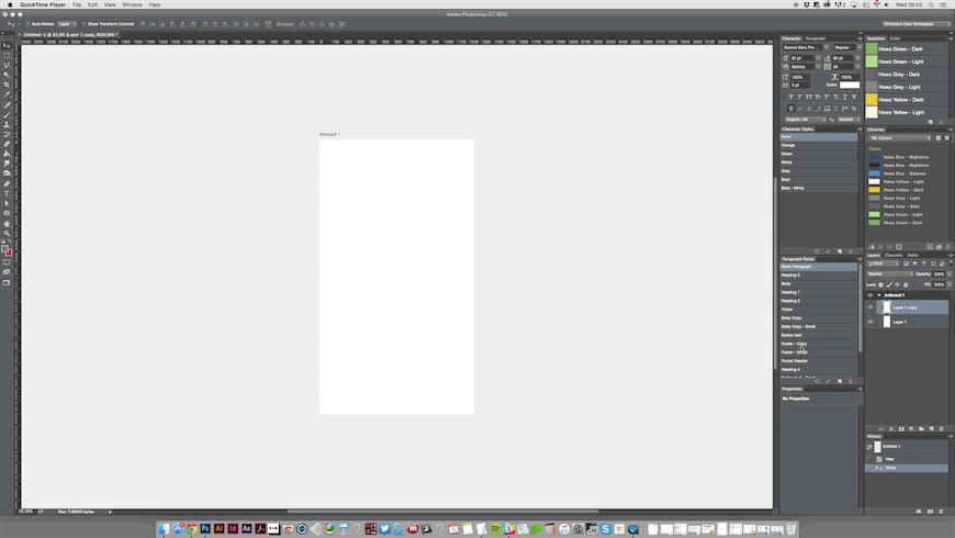
Artboards allow you to have multiple designs within one document, by allowing you to place multiple designs side-by side. These designs can be of varying sizes, with some preset sizes being made available to choose from including popular web, tablet and mobile sizes – even Apple Watch. This makes it great for designing responsive websites and apps, allowing you to work on the desktop, tablet and mobile views within one document.
You can easily drag and drop assets between artboards, which allows them to be linked – essentially allowing you to change an object on one artboard which then changes it across all other artboards. These can then be saved and exported individually – making this an extremely powerful and flexible new feature. So let’s dive right in!
Checking and updating your Photoshop version
First off, make sure you are running the latest Photoshop CC 2015 version. You can check your version by going to the Creative Cloud icon in your menu bar. If you need to update it will tell you.
Creating a new artboard
Once you have the latest version of Photoshop, fire it up and we’ll begin by creating a new artboard. Head straight to the File menu and select New, as you usually would when creating a new document. You’ll notice that there is a new document type option called ‘Artboards’. Selecting this shows you a whole raft of new document formats to play with.
Adobe have been really thorough here and have provided us with a large selection of preset screen sizes.
When it comes to layers and how these relate to multiple artboards, we can see that the artboards appear almost like a master group which contains the layers for that artboard. We think this is an extremely intuitive way of representing the layer hierarchy.
Duplicating an artboard
What if you wanted to duplicate an artboard? Well, this also works in the same way as Illustrator, again Adobe seem to have kept the functionality of this the same as it is in Illustrator – which is fantastic for consistency of workflow between products. Holding down the ‘Alt’ key whilst dragging an artboard will duplicate that artboard.
Once we have our designs ready to rock, we can easily export them to PNGs. This is useful if we quickly need to send our designs to the client for review. Exporting these artboards is as easy as right clicking the master layer group for the artboard (in the Layers panel) and selecting ‘Quick Export as PNG’. Alternatively, hitting the ‘Export as…’ option presents us with a new look dialog where we can choose to export our designs into various different formats – useful huh?
What if we wanted to quickly export these designs to PDF? Well Adobe have thought about this too. Head on over to the ‘File’ menu, hover over ‘Export’ and select ‘Artboards to PDF…’ – hey presto!
So, with artboards now added to our design arsenal, what can we do about retrofitting our old designs? Well, this is cool too! Just open your existing design and group all of your layers into one big master layer – now just right click on this master layer and select ‘Artboard from Group…’ – now we’re cooking!
I hope this post has helped you to understand the power of artboards and makes you feel comfortable jumping straight into using them!
Has this been helpful? Do you have any tips on using artboards? Leave us a comment below…
]]>
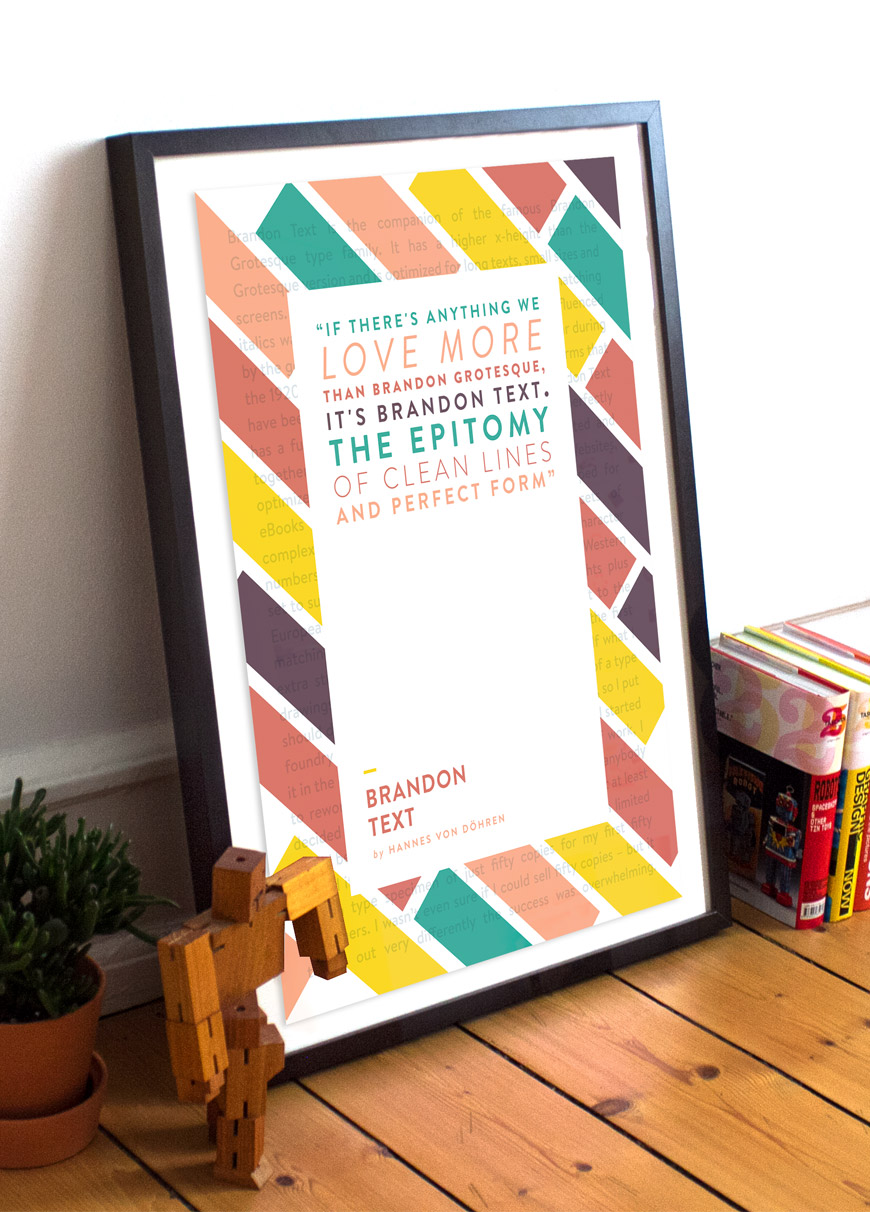
But first, a little background on this typographic beauty, taken directly from the creator’s website.
“Brandon Text is the companion of the famous Brandon Grotesque type family. It has a higher x-height than the Grotesque version and is optimized for long texts, small sizes and screens. This sans serif type family of six weights plus matching italics was designed by Hannes von Döhren in 2012.
Influenced by the geometric-style sans serif faces that were popular during the 1920s and 30s, the fonts are based on geometric forms that have been optically corrected for better legibility. Brandon Text has a functional look with a warm touch and works perfectly together with Brandon Grotesque. It is manually hinted and optimized for screens, so it will be a good choice for Websites, eBooks or Apps”.
Visit the creator, Hannes von Döhren at – http://hvdfonts.com/brandontext/