Our journey towards a better way of prototyping
Our clients are busy people. When we send them a wireframe or UI design to review, they need to understand what they’re seeing.
Usually we would create static wireframes in our tool of choice, whether Illustrator, Photoshop, and more recently, Sketch. We then send these wireframes onto the client, expecting them to imagine what would happen if they clicked a button or dragged an image.
This is fine for most projects, with the client able to grasp what we’ve designed with a brief explanation of the elements within the design and how these would interact. They would then come back with any questions and we would answer these — culminating in a design which is both agreed and understood.
However, there are some projects that need an extra level of interaction. The ability to tap, click, swipe or drag can be key to making a great design more easily understood.
The key is to make a design work not just how we intended, but also how the client subconsciously expects it to work.
For these projects, we needed a tool that would allow us to add that extra layer of interaction and animation. These tools are known as prototyping tools, of which there are many, all vying to become our next best design friend.
The aim of this article is not to give a direct comparison between all the tools we evaluated, but to elaborate on our experience of using them — and ultimately, decide what works best for us. You might decide otherwise, which is great, that’s cool — we’re not monsters.
The quality and functionality of these prototyping tools vary wildly, but they all work in at least one (or more) of three ways; Page-based, Element-based and Hotspot-based. Allow me to explain…
Page-based, Element-based and Hotspot-based
Page-based prototyping
is the ability to link individual screens together to navigate through them one-by-one. There is commonly only one interaction assigned to the whole screen, which is usually in the form of ‘On screen click, move to screen X’.
Depending on the level of functionality, this interaction can be combined with an animation (left swipe, fade in) when moving from one screen to another.
Element-based prototyping
is the more powerful and flexible of the two types and allows us to assign interaction(s) and animations to individual elements on a screen — button, links, images etc.
Being able to apply interactions to individual elements allows us to create ‘real-world’ prototypes and to consider the user flow in a more in-depth way, covering all potential routes into and through an app or website (for example).
Hotspot-based prototyping
is a hybrid of the above two methods and allows us to create similar prototypes but in a more basic way. We can only apply interactions and animations to the screen as a whole, but using hotspots we can define interactions within areas of the screen.
What this means is that you are not actually selecting an individual element and applying an interaction, but rather drawing a hotspot over the element region and defining what should happen if the user interacts within this defined space.
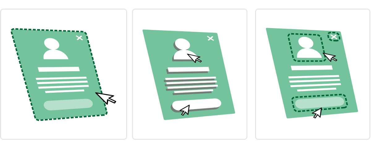
Page-based (Left), Element-based (Centre) and Hotspot-based (Right)
What features we’re after
Given our existing workflow, and without having to change the fundamentals of how we work day-to-day, we wanted to consider tools which had:
A killer user interface
We need an intuitive user interface, this is a given. Not something cobbled together in some guys basement using MS Paint. Something which scales back all of the tools and features into a usable, clean and familiar interface. It’s for this reason that we started using Sketch as a tool for designing some apps and wireframes — the simplicity of the interface.
Zero-training
We don’t want to have to send our designers off on a 2-week UX holiday just to learn how to use a piece of software. It’s also important that we don’t have to completely change our daily workflow to appease the tool of choice, which is why we looked at tools which integrated with Photoshop and Sketch.
Prototyping goodies
The more prototyping features the better. Everything from being able to create simple transitions between screens, animating UI elements and being able to preview these on-screen and on native devices (iPad, iPhone, Android etc). We want to be able to drag text onto a workspace, type something nice and then easily replace it.
Sharing stuff
The ability to share directly with clients, enable comments and then reply directly is of great importance to us. As I’m sure it is to you.
So, let’s crack on yeah?
![]()
InVision (Online) — Hotspot-based
Firstly, we’ve been using InVision for a few years now and for us it covers a multitude of needs. Everything from a central place to upload designs, share with clients and enable comments. We can add hotspots to static screens and link these to other screens very easily.
The team at InVision are doing a fantastic job, with new features coming out all the time. Where InVision falls down currently is its lack of animation and transition features. We’re hoping this will all change with an upcoming feature which InVision are calling ‘Motion’. It looks like a game changer. If they get Motion right, coupled with the existing feature set within InVision, this could be the only tool you need. We’ll have to wait and see — check out the promo for this yourself at http://blog.invisionapp.com/motion-prototype-animation/
The interface
The look and feel of the whole InVision interface is pretty darn great. Everything is clean and intuitive to use. We found InVision to have a quick learning curve — even our Account Managers, Copywriters and office pooch got to grips with it easily enough. Managing multiple projects on the system is very easy to understand (see Fig.1)
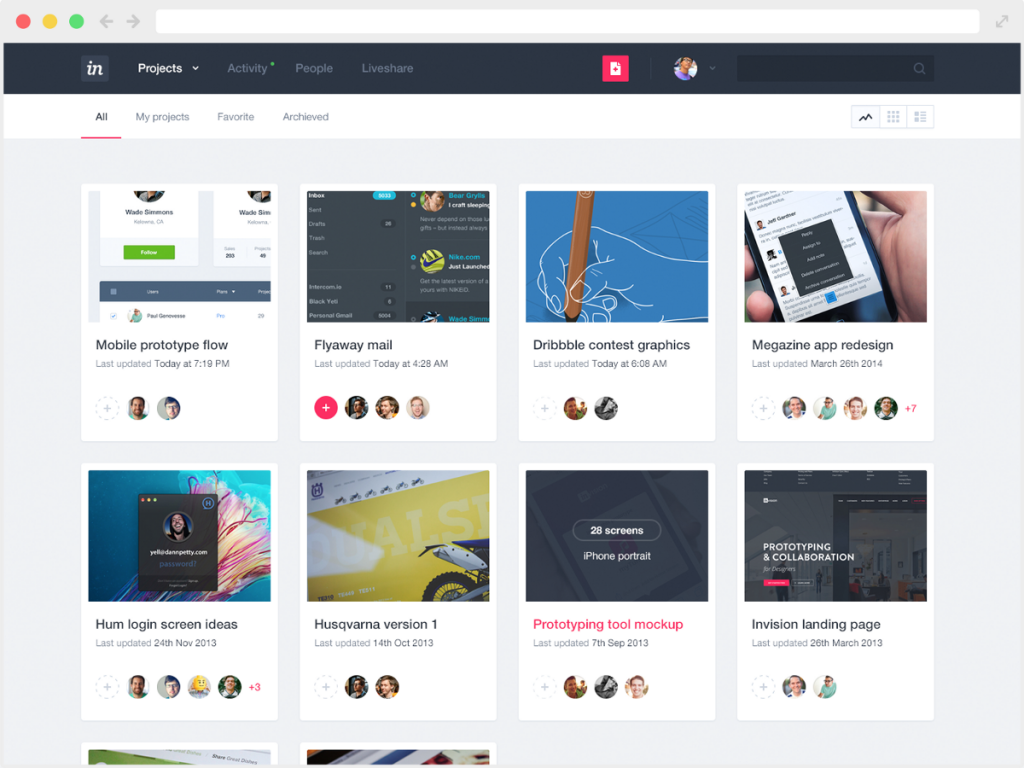
Fig.1 – the InVision interface
The features
Interactivity is key for us, and InVision let’s us handle this easily. We can import the UI for an app screen, add hotspots and interactive hovers, and send this to the client — all within the time it takes for our developer Jon to make a greasy cup of tea. The commenting system is powerful and fully formed, allowing our clients to easily click on a portion of the design and add any feedback.
Niggles & Bugs
We do sometimes encounter weird juddering on the project overview screen, which seems to be related to scrolling within the browser — sometimes I’ve had to refresh the page to stop this from happening. Also, keeping track of comments can sometimes be difficult, especially if you have clients that like to comment on every single pixel of the design.
Pros
- Very clean and intuitive user interface
- Quick learning curve
- Easy to use interactivity features
- Commenting system
- LiveShare is excellent
- Simple transitions and gestures using the overlays feature
- Integrates and syncs with Sketch and Photoshop
Cons
- Very limited animation and transition features — limited to hotspots to move between screens and some hover effects
- Cannot design within the interface, designs are imported and hotspots applied on-top.
Summary
Overall, we can see InVision being part of our future for some time to come. It does most of what we need, and, should Motion prove to be powerful enough, may even turn into our one-stop shop for prototyping interactivity and animations. You can find InVision here.
Principle (OS X App) — Element-based
A Mac only, standalone app for creating animated and interactive user interface designs. It does what it says on the tin.
The interface
Comprising of a main window, with all the design and interaction tools, and a preview window showing a live view of your current prototype. The idea of a separate preview window is good in theory, although it makes the interface feel a little disjointed. There’s no denying that it is still useful and helps to quickly iterate the design.
It has the simplicity of a Keynote-like interface including all element properties and settings in the sidebar (see Fig.2)
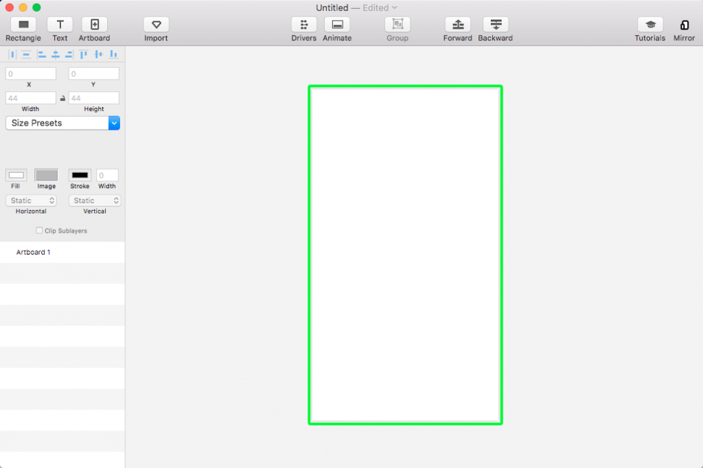
Fig.2 – The Principle interface
I couldn’t help feeling like all the elements available to me weren’t immediately apparent . The part of the interface where the element tools are grouped feels very basic, with only Rectangle and Text being visible (see Fig.3)
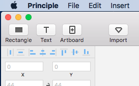
Fig.3 – Where my Circles be at?
I would have at least expected a Circle or Shape tool. In comparison, UXPin gives you a veritable smorgasbord of element tools (see Fig.4)
Fig.4 – Elements galore!
The features
Principle’s strength is in its interactivity tools. It uses a timeline-based system for adding time-based animations and interactive elements. This seems very powerful, yet familiar, feeling very much like a mix between the animation timeline in Photoshop and the parameter-based keyframe system of platforms like Flash and After Effects. It’s worth noting that those with experience of using Sketch will find its interface very familiar — Principle even goes as far as to utilise some of the same icons in it’s UI.
The niggles/bugs
The only niggle we had was with the colour of the interface, not really a deal-breaker but sometimes staring at a grey/white interface for hours at a time can screw with your mind — it would be nice to be able to change to a darker version perhaps.
Pros
- Great for interaction design (including motions and gestures)
- Uses timelines for more advanced animations
- Integrates with Sketch
- Live Preview is useful
- Preview on native devices (via Principle Mirror app)
Cons
- Cannot share online (only export to video or animated gif) — not good for sharing an updatable URL with clients.
- Limited tools for creating elements
- Live preview screen can sometimes feel in the way
Summary
If you’re looking for a tool which has powerful interactivity features, and you are comfortable with the slightly more advanced timeline/keyframe way of working, then Principle may be the tool for you. Just be aware that it’s not made for designing with and is just purely a way of applying interactions and animations to imported designs.
UXPin (Online) — Element-based
This online prototyping tool is a fully-featured, mature system which allows you to design, animate and add interactivity, integrates seamlessly with Sketch and Photoshop, with export plugins available for each.
The interface
The interface is, on the whole, very good. You can change the colour of the interface to be darker or lighter to suit your preference. Adding interactions/animations is very intuitive. It’s very much like the UI of the other systems we’re reviewing but based in the browser. UXPin have done a good job of making this usable in the browser, barring the ‘States’ panel, which is extremely frustrating to use (see Fig 5).
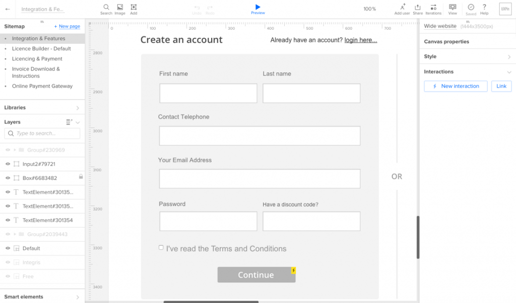
Fig.5 – The UXPin interface
The features
Smart elements are a great way of reusing elements across multiple screens. The included element libraries are very good and there are lots to choose from. Also, like the other systems we are reviewing, UXPin utilises a layers palette to keep track of elements on the design.
Sharing is one of the UXPin systems greatest assets, allowing you to share your prototype online at the click of a button. This is exactly what we need to send to clients, without the need for them to install any extra software/plugins — it just works directly in the browser.
The niggles/bugs
We find the interface to be very buggy, sometimes to the point where we think certain functionality is just not finished. Creating new element ‘States’ is touch and go, sometimes it works and sometimes it doesn’t. It is also very difficult to see what states are already created, as the States of the UI is partially hidden —and yes, we tried to increase the size of the ‘States’ panel — but we just couldn’t get it to go any bigger. The ‘Undo’ feature is also flakey, sometimes you have to press undo twice before it does anything (although I believe they may have fixed this in the new update).
Pros
- Integrates with Sketch and Photoshop
- Great Customer Service and Support
- Actively developed with regular features and updates
- Live preview
- Good set of interaction design features
Cons
- Very buggy!
- Some elements either very frustrating to use or just plain don’t work
Summary
The number of features, integration options and sharing/collaboration functionality makes UXPin a very strong offering, but when trying to create a complex prototype, we found that things quickly became very difficult to keep track of.
Pixate (OS X App) — Element-based
Pixate’s strength lies with its powerful conditionals-based animations and interactions. There is a generous selection of animation and interaction effects, which, when coupled with the use of conditionals, allows you to effectively chain different interactions and animations together. Pixate became part of Google in 2015, and other than a major 2.0 release last December, there hasn’t really been much activity within the Pixate camp. However, we really think that the tool has potential so we included it in our review.
The interface
We found the interface to be very intuitive, with a very shallow learning curve. All the tools and properties are laid out clearly, some of them in a similar way to how they are laid out in UXPin.
Unlike other tools, you cannot create new designs in Pixate. To create prototypes you need to design your screens elsewhere and import them. The import process is very simple and once your screens are imported, they are easy to keep track of in the Layers palette.
What it lacks in design tools, it more than makes up for in the power of its other prototyping abilities (see Fig.6)
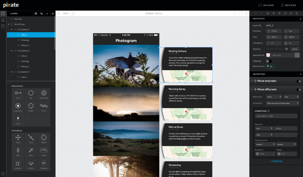
Fig.6 – The Pixate interface
The niggles/bugs
Ok, we found it to be buggy. We often had to find a workaround for something very simple. Maybe now Pixate is part of Google, it will be able to fix some of the bugs.
Pros
- Advanced conditionals (if-then-else) are quite powerful
- Complex interactions can be achieved using ‘chaining’
- Actions feature has real potential
- Support for different device resolutions
Cons
- Cannot export to web, not great for showing a client
- Client needs either a web account or the Pixate app installed to be able to view prototypes
- A bit buggy
- Doesn’t appear to be as actively developed as some other offerings
Summary
The tool is quite powerful and has real potential. It will be interesting to see just how the tool evolves now that the design team are part of Google. it may be that Google integrates Pixate as part of their own offering, in which case it is worth hoping that the tool’s power is retained. www.pixate.com
Other tools We also looked at other tools in addition to the above, these included:
Origami — Facebook’s own prototyping tool
Proto.io — not a great UI and also has a steep learning curve
Marvel — interface felt a bit too basic, although it has great collaboration tools
And now, the conclusion.
We came to the conclusion that we would continue to use InVision for where hotspot-based prototyping was appropriate. And, until they release their ‘Motion’ suite of tools, for anything more complex we would use UXPin. Despite UXPin’s buggy interface and having to create frustrating workarounds, it provides us with the exact set of tools we need — intuitive creation of interactions, a great auto-saving feature and extremely useful sharing/collaboration functionality.
We hope you have found this article useful, please feel free to add your own reviews and comments below!