A vibrant new brand for Verso
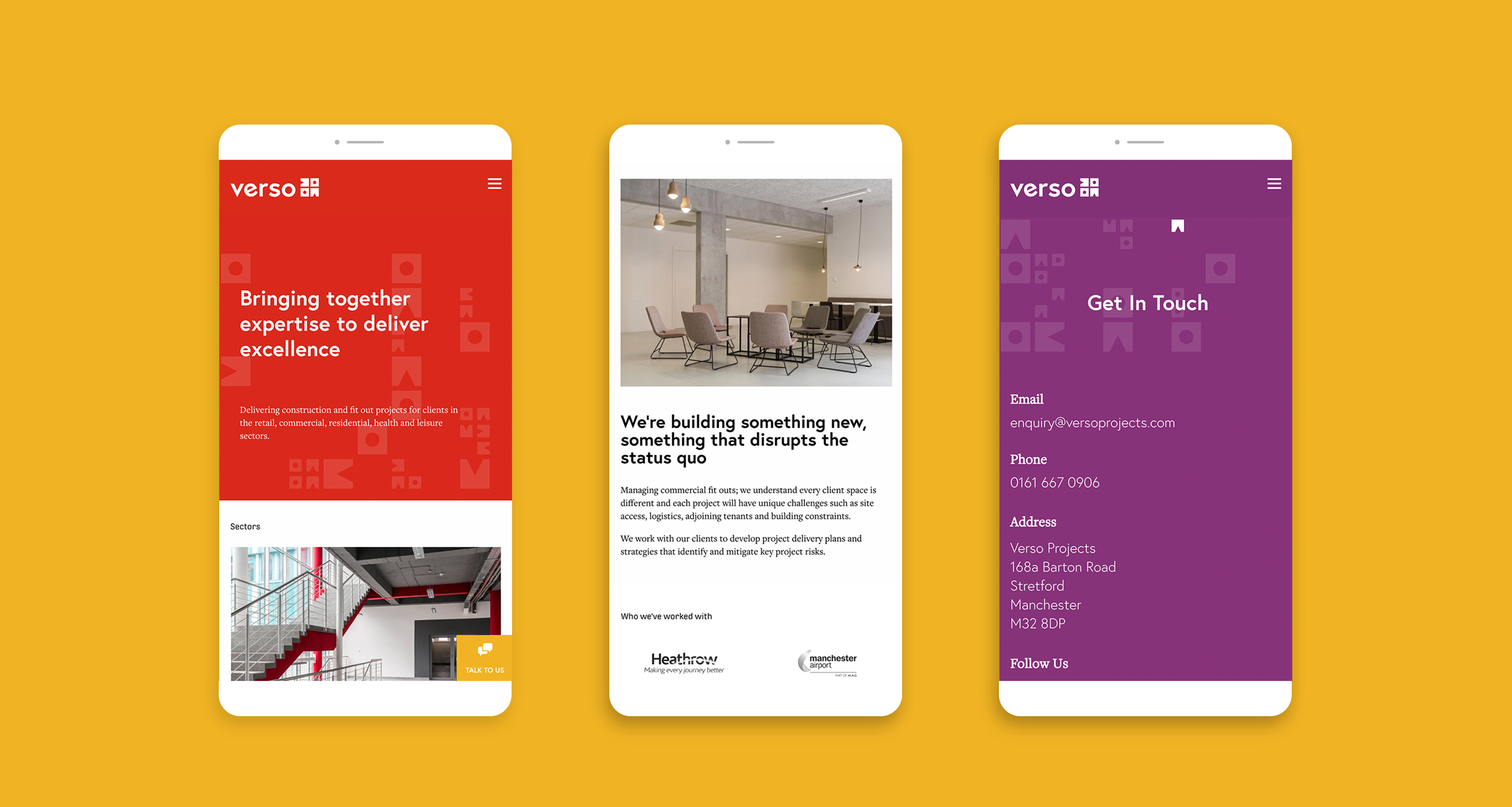
Verso deliver construction and fit out projects in the retail commercial, residential and leisure sectors. We were approached by Ian and Dave to rebrand their new venture, formerly Evolve Management Consultancy. It’s great to work with clients who have a clear idea of direction and purpose, and allow us to take the creative lead.
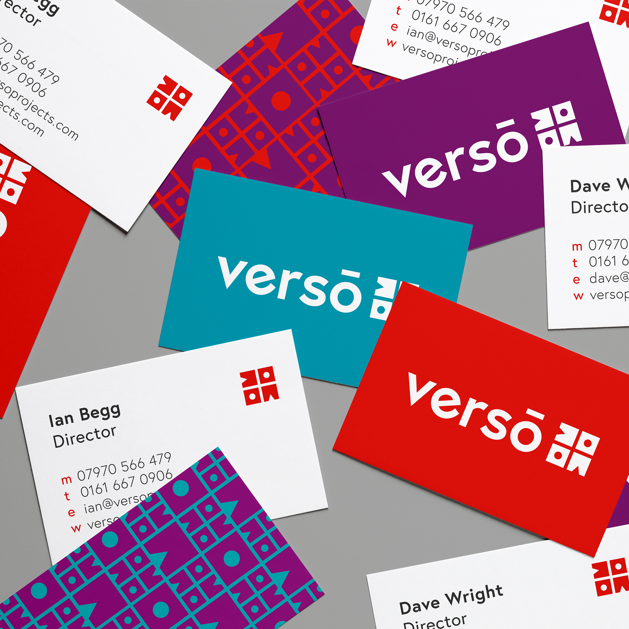
The name Verso came from the latin word meaning to turn or turn over, drawing on the idea of renewal, or changing a space. It is also suggestive of the idea of being ‘well-versed’ or skilled. The brand features a bold, modern typeface, and a geometric graphic icon. There are four vibrant colours in the palette to illustrate the diversity of skills, and the forward-thinking approach of the company.
The icon is made up of two different blocks which illustrate the diversity of skills brought together by Dave and Ian; the blocks are also synonymous with the idea of building and construction. The blocks are repeated and turned over to create the icon.
The icon is used to create a range of patterns which are recognisable from a distance on large scale print such as hoardings and livery, and can also be used to frame feature images.

